How to Write a Getting Started Guide: The Beginners Guide!
First impressions matter. When a user tries your product for the first time, a well-crafted Getting Started Guide can make all the difference.
It’s the friendly tour guide that welcomes new users, shows them the ropes, and sets them up for success.
In this guide, I’ll explore everything you need to know about creating an effective getting started guide. From its purpose and key ingredients to writing tips, examples, and templates.
Why bother? A clear getting started guide is often the cornerstone of that onboarding. It empowers users to self-serve, reduces basic support questions, and builds confidence and trust in your product.
Ready to dive in? Let’s start!
In This Guide

We rigorously test and research every product that we recommend through HeroThemes. Our review process. We may also earn a commission if you make a purchase through our links.
What is a Getting Started Guide?
A Getting Started Guide is a concise, user-friendly document (printed or digital) that helps new users begin using a product or service successfully.
Think of it as a beginner’s manual focused on the essentials. It usually covers initial setup steps, the fundamental features or tasks a user should try first, and tips to avoid common pitfalls.
The goal is to get users to their “aha!” moment as quickly as possible.
In practical terms, a getting started guide provides basic setup instructions (often in a step-by-step format), simple usage examples, and maybe a few troubleshooting tips for immediate issues.
It shows users how to start getting value from the product right away. This initial hand-holding goes a long way toward reducing frustration and encouraging users to explore further.
In short, it’s the product manual’s friendly little sibling – laser-focused on helping users hit the ground running.
Getting started guides come in many forms:
- For software, it might be a Welcome tutorial or a “Getting Started” section in the online help.
- For a physical gadget, it might be a small folded quick start guide booklet or sheet in the box (often accompanied by a full manual for later reference).
The key is that it’s comprehensible and accessible. Written in clear language, assuming minimal prior knowledge, and often including visuals to illustrate key points.
Purpose of a Getting Started Guide
Why create a getting started guide at all? Simply put, its purpose is to smooth out the steep learning curve that any new product has.
Here are a few major benefits and purposes of getting started guide:
1. Guiding Users Through Initial Setup
Every product has unique quirks that can overwhelm first-time users. A getting started guide walks them through the initial setup or installation step by step so they aren’t left guessing what to do first.
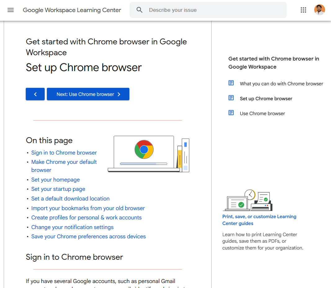
This immediate guidance provides quick gratification, users feel “Great, I’ve got it working!” instead of “I have no idea where to begin.” That positive first experience can distinguish users who remain loyal from those who give up early.
2. Reducing Support Burden
Users prefer to help themselves when clear instructions are available. A good getting started guide answers the basic “How do I…?” questions, so users don’t need to contact support for simple issues.
This self-service not only makes users happier, it also lightens the load on your support team.
Your guide becomes the first line of support, handling the easy stuff and freeing your team to tackle more complex questions.
3. Building Confidence and Trust
Starting with a new tool can be intimidating. A gentle introduction encourages users to explore features rather than shy away.
By highlighting a few core functions and showing how to use them, the guide invites users to play around and discover value.
It’s like giving them training wheels, they gain confidence to ride on their own. This encourages deeper engagement with your product and can convert casual users into power users or loyal customers.
4. Shortening the Learning Curve
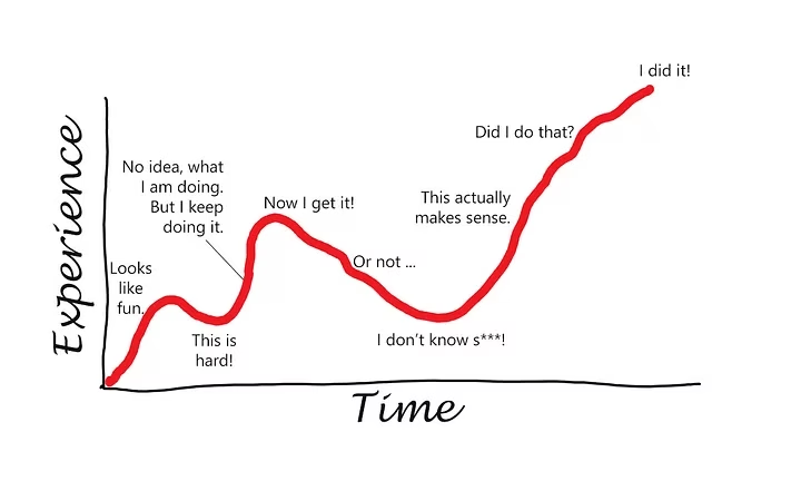
No one likes feeling dumb when using a new app or device.
A getting started guide keeps the learning curve shallow by teaching in small, manageable steps.
Users learn the basics first, then gradually tackle advanced features. This stepwise approach prevents the overwhelm that a steep learning curve can cause.
The result: users stick around longer instead of churning out of frustration.
5. Standardizing Onboarding
From an organizational perspective, a getting started guide ensures every new customer receives consistent onboarding information.
It’s your chance to put your best foot forward with each user.
For SaaS companies or software teams, it’s also a way to showcase important features or best practices early on.
In the case of physical products, it can cover safety warnings or setup precautions so users don’t miss them.
The purpose of a getting started guide is to empower the user. It’s there to say, “We know you’re new. Here’s exactly how to start succeeding with this product.”
When done well, it lays the foundation for a positive ongoing experience for users.
What to Include in a Getting Started Guide
So, what goes into a great getting started guide?
While specifics vary by product, most effective guides share a common structure and ingredients. You can think of it as a simple recipe:
1. A Brief Overview or Welcome
Start with a short introduction that tells the user what this guide will help them accomplish.
Set expectations upfront. For example, a sentence or two might explain: “This guide will help you install the app and send your first message in under 5 minutes.”
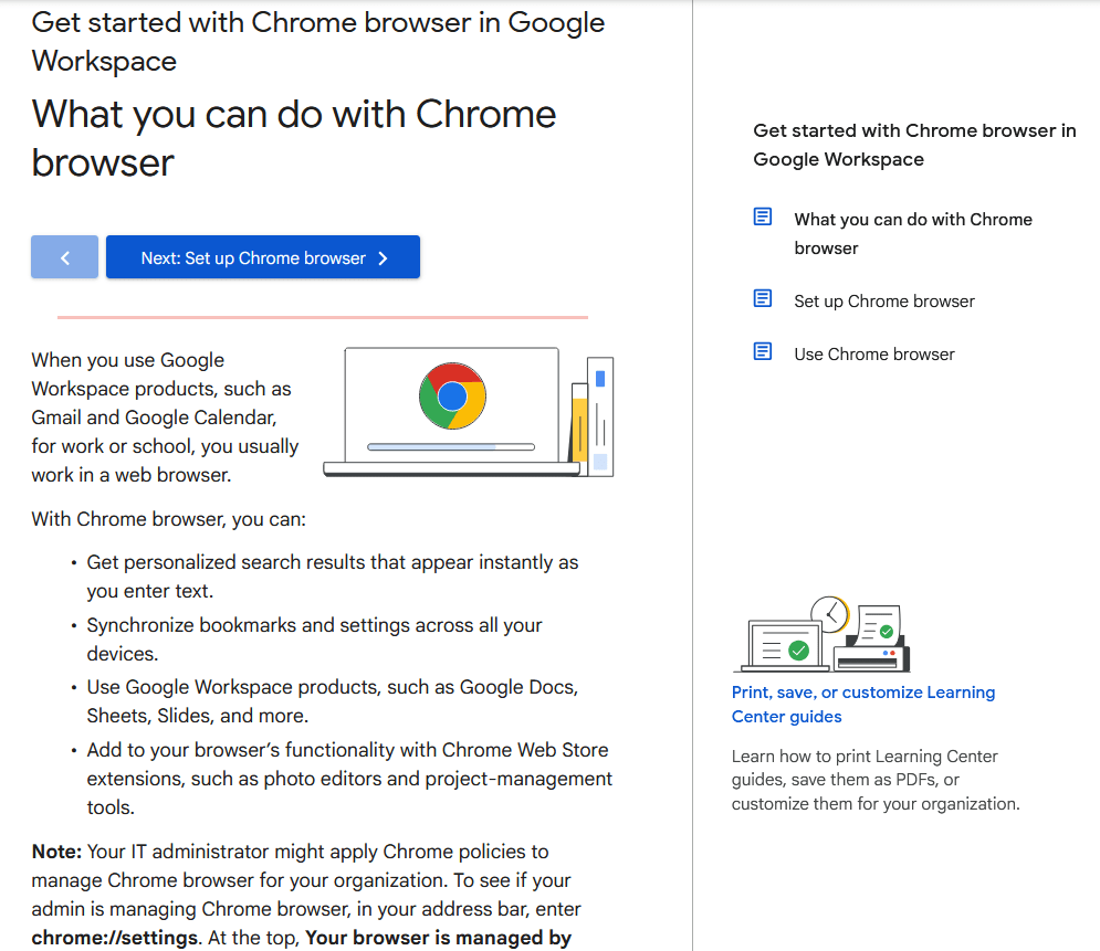
Keep it very concise. The user likely wants to dive in quickly. You might list the primary steps or sections they’ll go through. The overview essentially answers, “What will I learn or do with this guide?”
This helps motivate users to follow along because they know the end goal. (It’s also a good place to congratulate them on choosing your product – positivity never hurts!)
2. Step-by-Step Instructions for Initial Tasks
The heart of the guide is a clear, stepwise tutorial for the most important getting started tasks.
This usually includes installation or setup, account creation or login, and performing the first basic action in the software/service (or basic operation of a device).
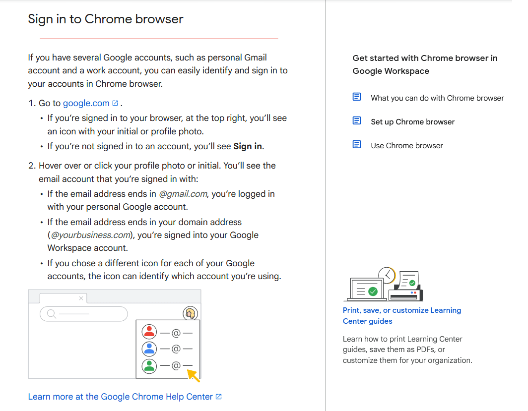
Provide instructions in a logical order, and keep each step bite-sized and action-oriented.
Numbered lists are your friend here. Each step should tell what to do and how to do it, without ambiguity.
For example: “1. Download the app: Visit example.com/download and click Install. 2. Create your account: Open the app and fill in the sign-up form…”, and so on.
If a step is too complex or long, consider breaking it into sub-steps or simplifying the task. The rule of thumb: one clear action per step.
3. Screenshots or Visual Aids
It’s much easier to follow instructions when you can see what’s being described.
Great getting started guides include relevant images: screenshots of the software interface, photos or diagrams of hardware setup, or even small GIFs/videos for tricky steps.
For example, if step 3 is “Click the Settings icon,” show a screenshot with the settings icon circled or highlighted.
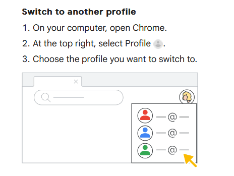
Pro tip: also add descriptive alt text to images in digital guides, so they’re accessible and so users can search for text that might be in an image.
4. Key Feature Highlights or Next Steps
Once the basic setup is done, a getting started guide often briefly points out “what next”.
This could be a short section like “Explore Next” or “Key Features to Try”.
The idea is to introduce a couple of the most important features or things the user should do after the initial setup.
5. Links to Further Resources and Support
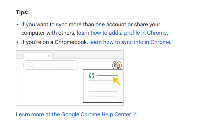
A good getting started guide recognizes its scope, it covers the basics, but some users will have more questions.
Always provide an easy path for those who need more help.
This might be a final paragraph or box: “Need more details? See the User Manual for advanced setup and troubleshooting.” or “Visit our Knowledge Base for detailed articles on each feature.” Include links to your documentation site, FAQs, video tutorials, community forums – whatever support channels you have.
For a physical product, you might reference the full printed manual or a support phone number.
The goal is to reassure users that if something isn’t covered in the quick guide, there is somewhere to find the answer.
Additionally, encourage them to reach out to customer support for any issues not solved by the guide.
By sharing documentation and support resources up front, you smooth out the entire onboarding experience. Users know where to go if they get stuck, beyond those first steps.
Putting it together, a simple getting started guide template will look like this:
- Introduction: One short paragraph welcoming the user and stating the guide’s goal (e.g., “In 5 minutes, you’ll have X set up and ready to use”). Possibly bullet out the steps to come.
- Step 1: Do the first thing. Explanation or instructions for step 1 (with an image if applicable).
- Step 2: Do the next thing. Instructions for step 2 (with image).
- Step 3: … and so on through the essential setup/use steps (keep it to the truly essential!).
- Next Steps / What’s Next: Briefly mention what the user can do after the basics (point to a couple key features or advanced tutorials).
- Resources / Support: Provide links or references to more detailed help (knowledge base, full user manual, support contact). End on an encouraging note, e.g., “Happy learning!” or “You’re all set to explore our product – enjoy!”
This outline can be adjusted depending on whether your guide is a single-page quick reference, a short booklet, or an interactive online tutorial.
The core idea is to keep it focused on the beginner’s needs.
As the technical writer puts it:
Don’t assume the user already knows anything – meet them at their level.
Finally, formatting can make a big difference.
- Use clear headings for each part of the guide (so users can easily skim or return to a section).
- Bullet points and numbered steps improve scannability versus long paragraphs.
- In digital guides, you can even break content into tabs or collapsible sections for each step.
- The guide should feel easy to read at a glance – friendly and not overwhelming.
- Many successful guides even include checkboxes by each step or a checklist at the end, so users feel a sense of accomplishment as they progress.
The easier it is on the eyes and brain; the more likely users will follow through.
Getting Started Guide Template (Outline Example)
Let’s solidify the above into a concrete template. Below is a generic Getting Started Guide template structure you can adapt to your needs.
This template assumes a digital software product for example’s sake, but you can tweak the concepts for a physical product too. Use this as a starting point:
1. Title & Welcome:
“Getting Started with ProductName” (and a one-line welcome or product tagline if desired).
For example: “Welcome to ProductName! This quick guide will help you set up and accomplish [main goal] in just a few steps.”
2. Prerequisites (if any):
(Optional) If the user needs anything before starting, list it briefly.
For example: “Before you begin: make sure you have an active account and the device is charged.”
3. Step 1 – [First Setup Step]:
Describe and instruct the first step. Start with an action verb.
For example:
“Install the App:
- Go to our Download page and download the installer for your OS.
- Run the installer and follow the on-screen prompts.
- Once installed, open the app.”
(Include a screenshot of the download page or the app icon if helpful.)
4. Step 2 – [Next Step]:
Continue with the next essential step.
E.g., “
Create Your Account:
- In the app welcome screen, click Sign Up.
- Enter your email and choose a password.
- Check your email and click the verification link.
- Once verified, sign in to the app.”
(Screenshot of the sign-up form or confirmation message.)
5. Step 3 – [Initial Use or Core Action]:
E.g., “Send Your First Message: Click the New Message button (see image below). Type a message to yourself or a teammate and hit Send. Congrats – you just sent your first message!”
(Screenshot showing the New Message button highlighted, and maybe an example message draft.)
6. Step 4 – [Another Key Action]:
Depending on the product, there might be another primary action. Keep going in order of what a newbie must know or do. If none, you can skip straight to the next section.
7. (If applicable) Step 5 – [Finish up]:
If there’s any wrap-up step, like completing a profile, adjusting a setting, or confirming something is working, include it. Otherwise, conclude the tutorial steps.
8. Next Steps / Learn More:
A short blurb that says, essentially: “You’re up and running! From here, you might want to try XYZ feature or explore ABC.”
For example: “Now that you’ve set up and sent a message, you can explore advanced features like creating Channels, setting notifications, and more.
Mention one or two popular next actions based on what most new users do next.
9. Support and Resources:
Finally, clearly point the user to where they can get help or learn more.
For example: “For more help, visit our Knowledge Base or see the full User Manual for detailed instructions. If you have any questions, contact support at support@example.com.”
You could list a few resource links: FAQ page, video tutorials, community forum, etc.
This template is intentionally simple. In reality, you might combine or omit certain sections based on context.
For instance, some guides integrate the “Next Steps” tips as callout boxes or side notes alongside the main steps.
Physical quick start guides often don’t have an explicit “Next Steps” – instead, they stick strictly to setup and then say “Refer to the user manual for operating instructions.”
One more tip: save your template and reuse it for consistency. If you produce multiple getting started guides (say, for different product lines or for different user roles), having a standard outline ensures all your guides have a familiar feel.
Need a platform to host and organize all these guides?
Try Heroic Knowledge Base to create beautiful, searchable documentation sites.
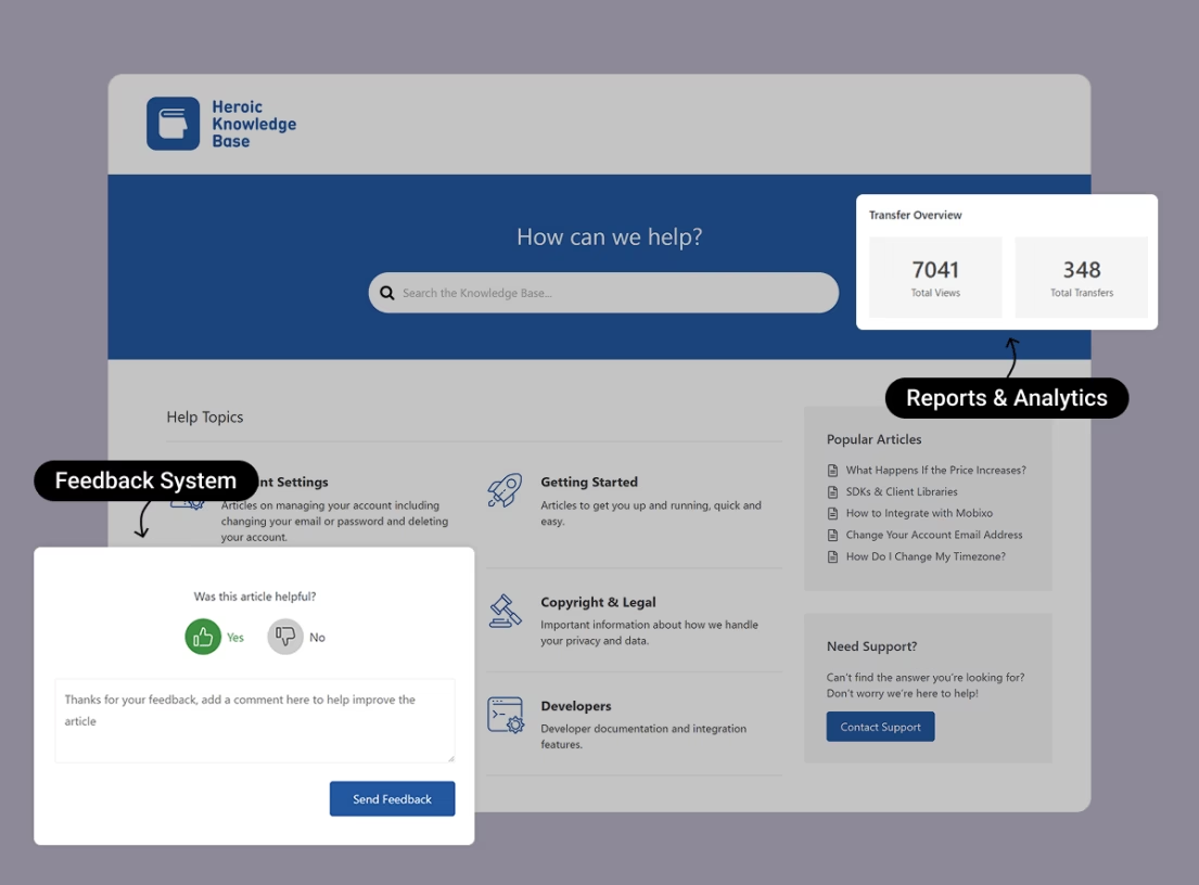
That way, your getting started guide can live alongside your FAQs, tutorials, and other help articles in one centralized hub. It also makes it easy to update content, track what users search for, and continually improve your docs.
Getting Started Guide Writing Tips
Writing a getting started guide is part art and part science.
You need the clarity of technical writing, the empathy of customer support, and a dash of marketing enthusiasm – all wrapped in a conversational tone that connects with readers.
Here are some top tips to keep in mind when writing your guide:
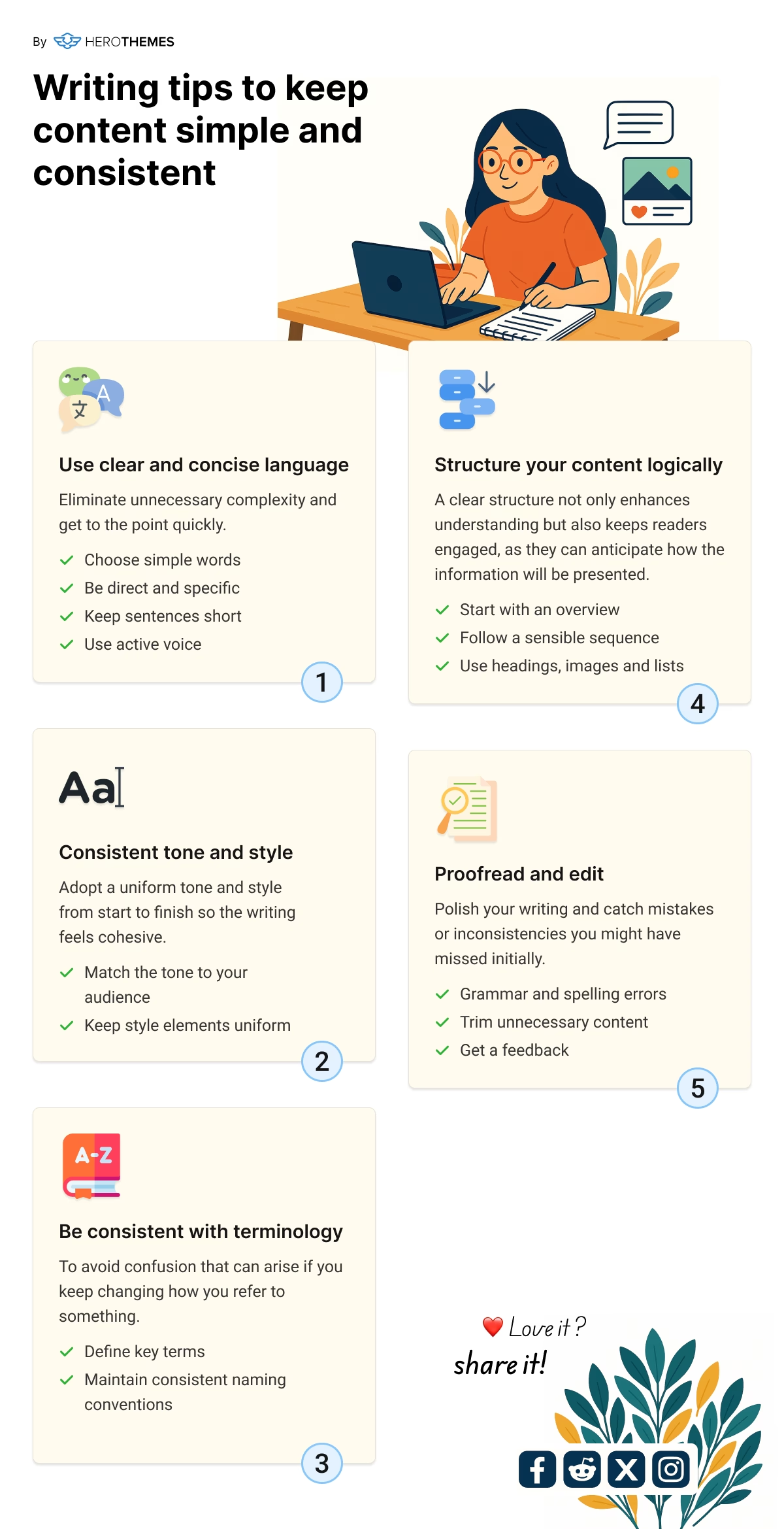
1. Use Simple, Jargon-Free Language
Remember, many readers are complete beginners. Write as if you’re explaining to someone with no background knowledge of your product domain.
Avoid industry jargon or acronyms unless you absolutely have to use them (and then define them in plain language).
Simplicity is key.
For example, don’t say “Initialize the configuration parameters”; say “Set up your basic settings.” Clear, everyday words where possible.
If you must include a technical term (say your product is an API and you need to mention “API key”), provide a brief explanation or analogy.
A good trick is to have someone unfamiliar with the product review your draft, if they get confused at any sentence, revise it.
The guide isn’t the place to show off vocabulary; it’s about communication. The tone should be friendly and encouraging, like a helpful colleague guiding the user.
2. Be Direct and Action-Oriented
Getting started guides should be written in an imperative voice. Essentially, you’re instructing the user on what to do.
Use active voice and lead with verbs in your steps (e.g., “Click Next to continue” instead of “The Next button should be clicked”). This makes instructions crystal clear.
Also, keep sentences short and focused. Long, winding sentences can lose a beginner halfway. Aim for one idea per sentence, or even use fragments for instructions where appropriate (“Choose File > Import. Select your data file. Click Open.” – it’s okay if it’s not a full formal sentence in those contexts).
Aim for a Flesch Reading score around 80, writing at roughly a 6th-grade reading level – which is great for broad accessibility.
That often means shorter sentences and common words.
Don’t worry, your guide won’t sound “dumbed down”, it will sound clear.
Clarity is a professional virtue!
3. Keep a Logical Flow
Structure your instructions in the natural order a new user would need to do things.
If there’s a critical sequence, for example, an account must be created before data can be imported, make sure the guide reflects that order clearly.
Users should never have to jump around or perform mental gymnastics to follow you.
Numbered steps enforce a logical sequence.
Additionally, use headings and subheadings to break the guide into digestible sections (setup, first use, next steps).
This not only helps users but also improves SEO, as search engines can identify the content hierarchy and keywords better.
A logical flow might also mean introducing concepts in a sensible order – e.g., define what a “Project” is before telling the user to create one.
If you find yourself needing to explain too much up front, consider whether that belongs in a separate “Concepts” doc rather than the quickstart.
4. Show, Don’t Just Tell
We touched on visuals earlier, but it bears repeating: wherever possible, show the user what to do rather than just telling them.
This could be through screenshots, diagrams, or even an embedded short video or video animation for an online guide.
Visual learners will thank you.
For example, instead of “Navigate to the settings menu,” you could include a tiny image of the UI with an arrow pointing to the Settings gear icon – now there’s zero ambiguity.
Similarly, highlighting UI elements with callout boxes or annotations.
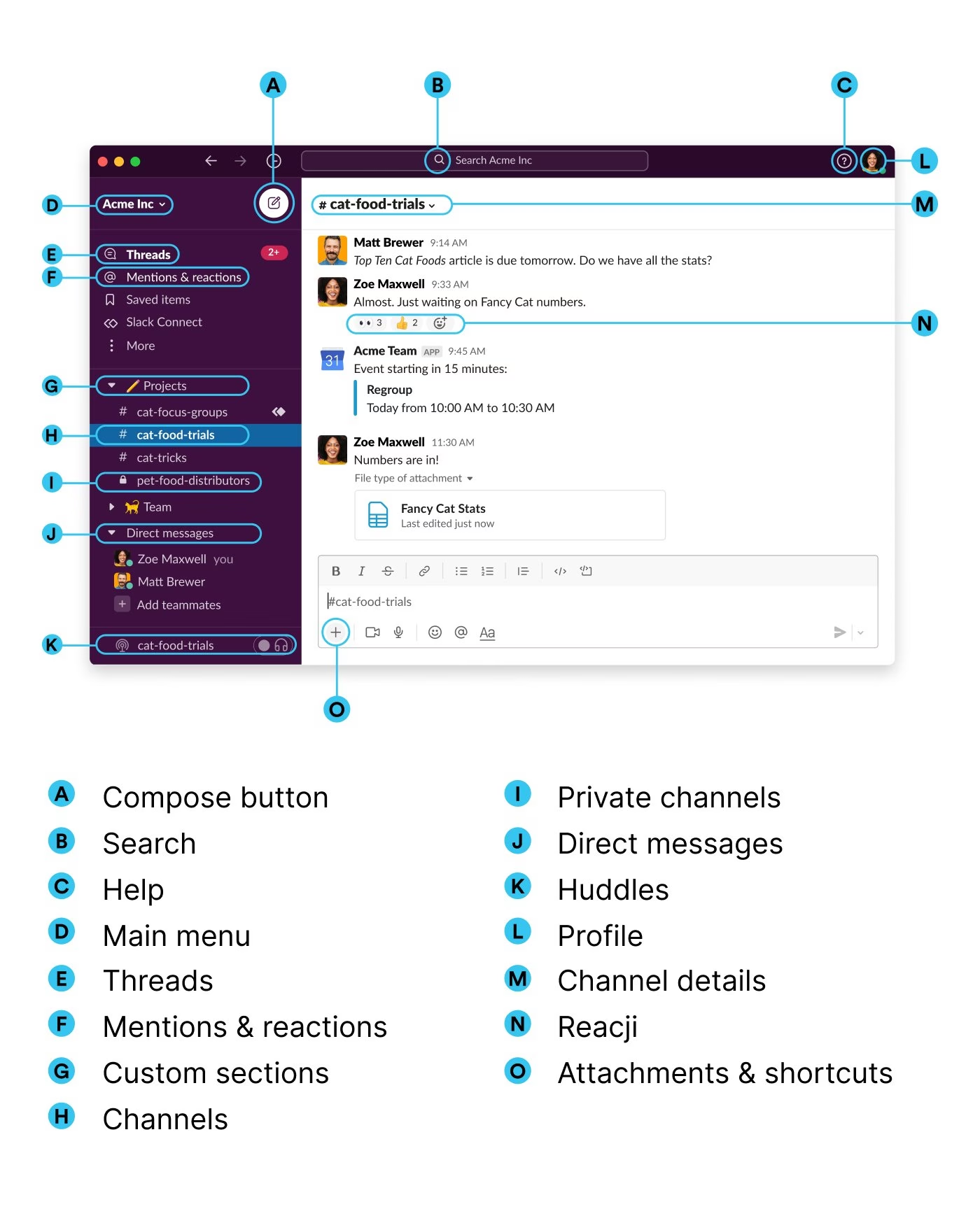
Slack’s user guides do a great job of this by labeling parts of the interface to help users orient themselves.
If you’re documenting a physical product, clear line drawings or photos of each step (like showing how to insert a SIM card into a phone) are immensely helpful.
Ensure your visuals are high-quality and appropriately sized. Blurry or tiny images can frustrate more than they help. And always tie visuals to the text so users know what they’re looking at.
5. Mind the User’s Perspective
Put yourself in the shoes of a new user. What are they trying to achieve? What might they be feeling or thinking at each step?
Address those.
Sometimes a beginner might not even know why they have to do a step. A brief justification can help, like “This step ensures your data is synced correctly” if it adds clarity.
Also, be careful about assumptions: Don’t assume they know where a certain button is or what a term means if it’s their first exposure.

If your guide is for a slightly technical audience (say, developers), you might assume some knowledge (like command line basics), but clarify anything that a new developer might not know.
For a broader audience, err on the side of over-explaining (in simple terms) rather than leaving a gap.
One strategy is to do a quick user research or gather common newbie questions and make sure your guide answers them.
If many first-time users ask “How do I save my progress?” then proactively include that in the guide at the appropriate spot.
Being attuned to user knowledge levels is part of good onboarding. You respect the user by neither talking down to them nor leaving them lost in the woods.
6. Keep Tone Encouraging and Human
A getting started guide isn’t a dry spec sheet. Feel free to inject a bit of personality and encouragement.
Phrases like “you’re all set!” or “let’s do X next” make the user feel guided by a person rather than a robot.
You can even use mild humor or relatable comparisons if it fits your brand. For example, “Creating an invoice is as easy as filling out a Facebook post, just enter text and hit send.”
A little levity can reduce user anxiety.
However, don’t overdo it and don’t distract from the actual instructions. Professional but warm is a good balance.
7. Emphasize Key Points (but Don’t Overwhelm)
If certain steps are critical, you can highlight them using bold text or notes.
For example: “Important: Make sure to write down your recovery code. You’ll need it if you forget your password.” This signals the user to pay extra attention.
You can also use italics for occasional emphasis or to introduce a term (like Project or Campaign if defining them).
Another tactic is using callout boxes or colored highlights for tips, warnings, or notes.
For instance, a yellow “💡 Tip:” box can share a shortcut or alternative method, while a red “⚠️ Note:” box can warn of common mistakes (“Don’t unplug the device during the update.”).
However, keep these to a minimum in a quick start – too many side notes can overwhelm.
8. Test the Guide with Real Users
Once you have a draft, try it out on a real new user if possible.
This could be a usability testing session or just giving the guide to a new hire or a friend and seeing if they can follow it successfully without other help.
Their feedback is gold. They might stumble on a step you thought was obvious, which means you should clarify that step. Or they might ask, “What does this mean?” at a certain instruction, which means you might need to reword it or add a brief explanation.
Testing will also show if your guide flow matches how users naturally set things up.
If in-person testing isn’t feasible, even just observing support requests from new customers can illuminate gaps.
For example, if many users contact support with a question that should have been answered by the guide, then the guide might need that info made more prominent.
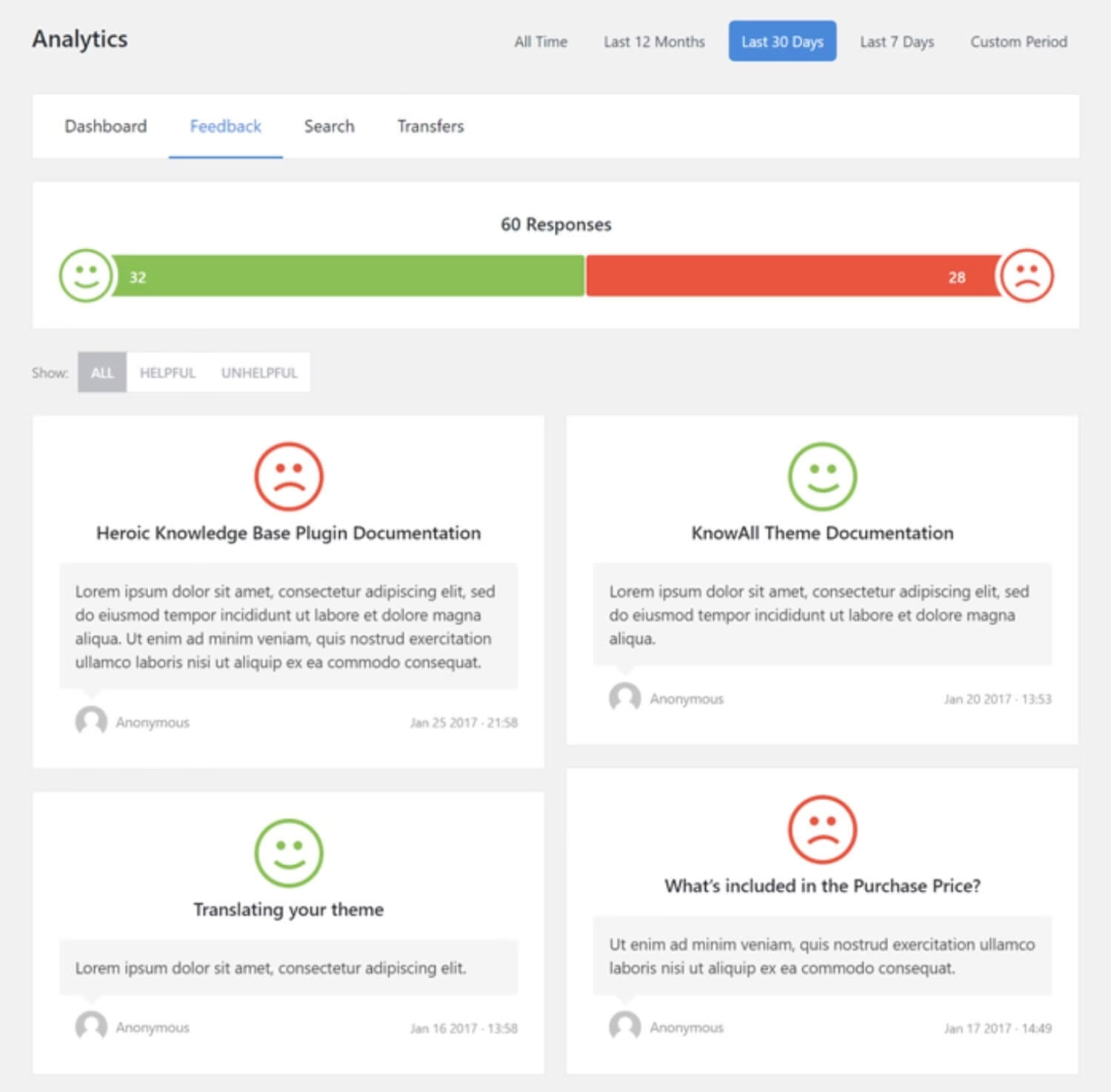
Use this feedback to iterate and improve your guide continually.
Documentation tools like the Heroic Knowledge Base offer features that allow you to collect user feedback and provide other useful insights. Use these tools wisely to improve your guides.
9. Keep it Short and Focused
It’s worth reiterating – brevity is key for a quick start guide.
Users typically won’t read a novella when they’re eager to start using the product.
If your guide is running long, say, more than a few pages or screens, audit it and ask: “Is this detail truly needed in getting started, or can it be moved to a later section of the docs?”
Trim unnecessary fat. One guideline from documentation experts is the 1/10th rule we mentioned: the quick start should contain only about 10% of the information of the full manual. It’s not an exact science, but it reinforces the idea that this is not the place for exhaustive detail.
Keep the focus on immediate needs. If you find the guide getting unwieldy because your product has a ton of features, consider splitting the guide by user goal or role.
For example, a separate “Quick Setup for Administrators” vs “Quick Start for End Users” so each audience gets a leaner experience.
In documentation, as in UI design, less is more for onboarding.
By following these writing tips, you’ll produce a guide that is not only informative but also engaging.
Explore:
How To Write Good Documentation — The Beginner’s Guide
How To Create Technical Documentation (Step-By-Step Guide)
13 Free Technical Writing Tools and Software of 2026
Getting Started Guide Examples
Let’s look at a few real-world examples of getting started guides and quick start guides to see these principles in action.
These examples span digital software onboarding as well as physical product guides:
1. Upwork Getting Started Page
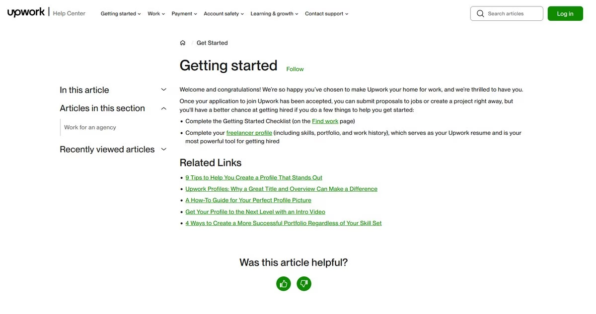
Upwork, a freelancing platform, has an excellent getting started guide for newcomers.
It starts by congratulating the user on joining and then lists a few key tasks to get their profile up and running: completing a checklist, taking an online course for new freelancers, setting up their profile, etc.
The language is encouraging and the steps are presented as bullet points for easy scanning. Upwork also provides links to deeper resources like “9 Tips to Help You Create a Profile That Stands Out”.
This guide doesn’t overwhelm with every site feature; it focuses on the critical things a new freelancer should do to have a better chance of success on the platform.
By doing so, it drives user engagement (a fully set up freelancer profile) and reduces confusion.
2. Google Docs Quick Start Guide
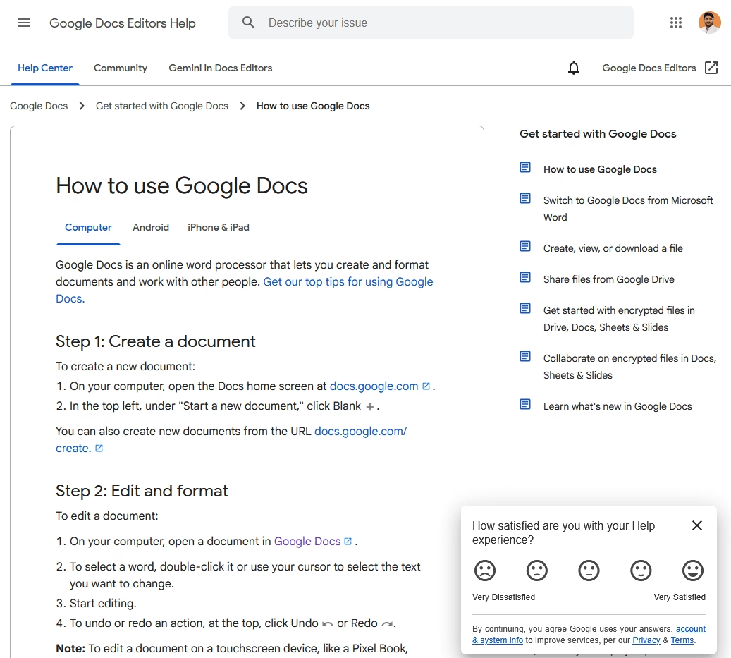
In the case of Google Docs, the help article “How to use Google Docs” essentially functions as a quick start guide.
One neat aspect is that it caters to different platforms: it has tabs or sections for Computer, Android, iPhone/iPad, recognizing that getting started might differ slightly by device.
The guide is very step-by-step. It begins with a brief description of what Google Docs is (an online word processor, etc.), then quickly moves into “steps to get started” like creating a new document, sharing it, and so forth.
Each step often has an illustration or icon. Google’s guides also link out to tips (like “Get our top tips for using Google Docs” for those who want to learn more advanced tricks).
The language is simple and assumes no prior knowledge of Google Drive or Docs. By breaking it down per device, it immediately addresses a user’s context. A mobile user isn’t overwhelmed with desktop instructions and vice versa.
This example shows the importance of identifying your user’s environment and tailoring the guide accordingly (which is a form of knowing your audience).
3. Slack’s Help Center home
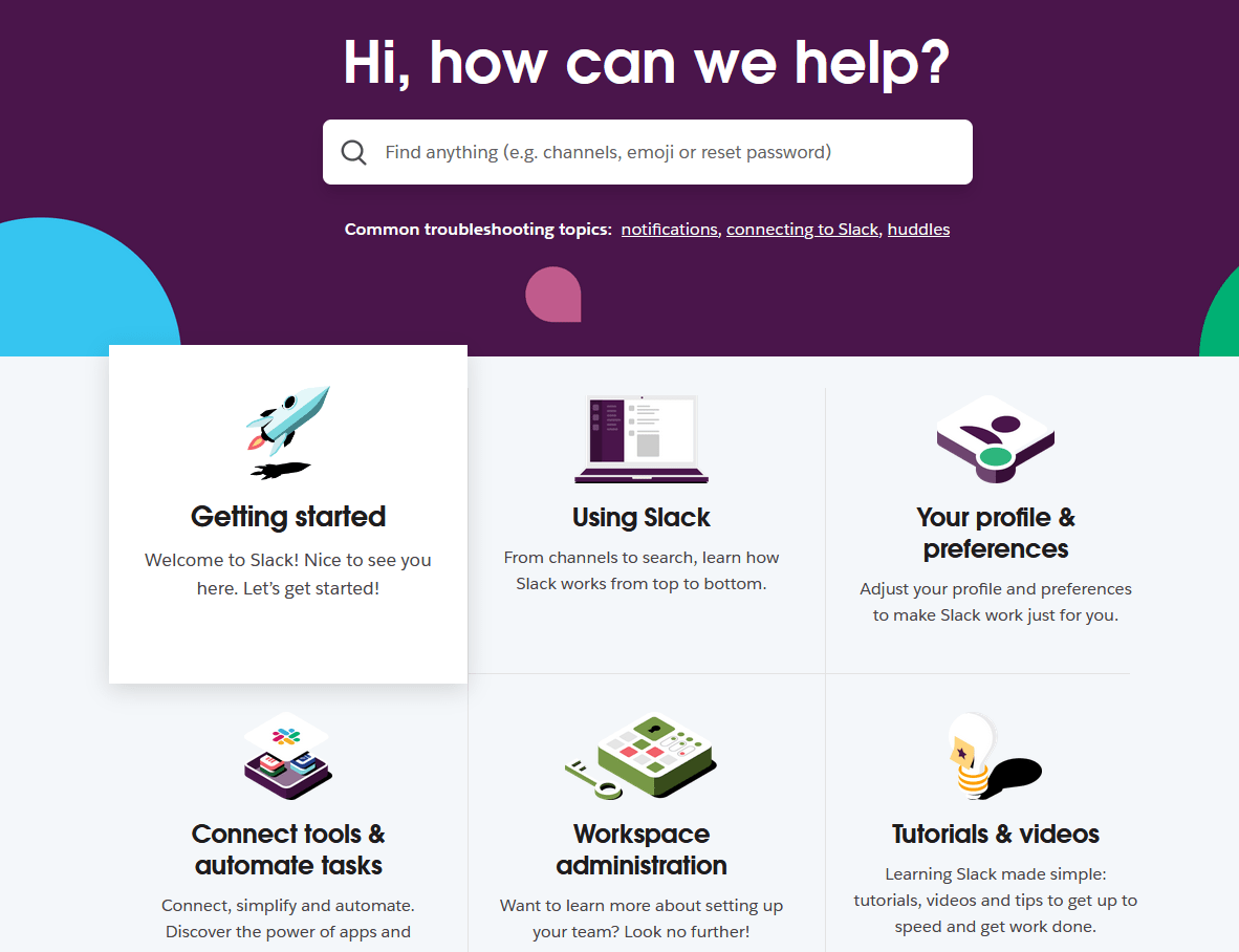
Slack, the popular messaging app, is often lauded for its excellent documentation and onboarding. On Slack’s Help Center front page, there is a clear “Getting started” category alongside other categories like Using Slack, Your Profile, etc.
This getting started section for Slack includes articles that guide new users through the basics.
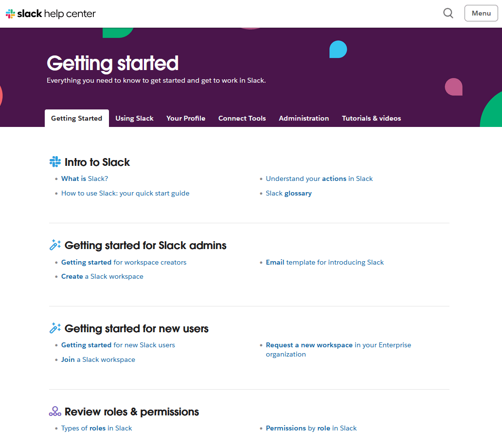
One of Slack’s getting started guides literally jumps straight into explaining the interface – so new users can get familiar with the terminology and layout.
Slack often uses annotated screenshots with callouts like “This is where your channels appear” and so on, making it very easy to connect the description with the actual app.
The Slack example demonstrates how a getting started section can orient users, and then the users can self-select what specifically they need help with. Maybe one user wants to know how to send a message, another wants to install the desktop app – Slack’s docs have separate quick guides for each.
This modular approach keeps each guide focused while collectively covering a lot of ground.
These examples teach us a few things:
- Tailor to the audience and context: Upwork’s guide is tailored to freelancers, HubSpot’s to developers, Slack’s to office workers, and gadget guides to device owners. The tone, detail level, and format all match the user’s context. E.g., developers get a more technical tone, general users get more visual hand-holding.
- Stay concise and task-focused: All the guides focus on enabling the first few tasks, not explaining everything at once. They act as launchpads.
- Use visuals smartly: From Slack’s annotated screenshots to Google’s platform icons to hardware illustrations, visuals are used wherever they can replace or reinforce text.
- Provide multiple formats if needed: Offering both an online and PDF version (Microsoft) or separating quick start vs full manual (GoPro) ensures users can choose how they consume the info. A PDF quick start guide is especially useful for printing or offline access – consider providing one if your users might appreciate that.
- Integrate with a larger documentation set: The getting started guides often link to or sit alongside more comprehensive resources. They don’t exist in isolation.
Explore:
12 Best Documentation Examples to Learn From (Expert Picks)
6 Software Documentation Examples to Inspire You in 2026
5 Best Knowledge Base Examples To Inspire Your Help Center
5 Best User Documentation Examples (Good & Bad + Tips)
Quick Start Guide (PDF) vs. Full Getting Started Guide
You might be wondering about the distinction between a “quick start guide” and a full “getting started guide” – aren’t they the same thing?
The terms are sometimes used interchangeably (and indeed, they overlap in purpose), but there are subtle differences in connotation and scope.
Let’s clarify the differences and similarities, especially as they relate to format (like PDFs) and content depth:
| Aspect | Quick Start Guide | Getting Started Guide |
|---|---|---|
| Length and Depth | Very short (1-2 pages), highly concise | Slightly longer, more detailed explanations |
| Content Scope | Immediate setup, essential first actions | Initial setup plus basic feature overview |
| Focus and Goals | Quick action, instant gratification | Initial competency, broader understanding |
| Typical Format | PDF, printed insert, short document | Web page, knowledge base article, booklet |
| Presentation Style | Terse, diagrams, stepwise instructions | Slightly narrative, additional context/tips |
| Content Overlap | Subset of Getting Started Guide | Includes Quick Start content plus extra |
| Use Case | Quick reference for immediate installation | Broader onboarding and basic usage |
| Interdependence | Complements, doesn’t replace detailed docs | Complements Quick Start and full manual |
| User Preferences | Users needing fast setup instructions | Users wanting deeper introduction |
| Example Use | Printer installation steps | Software interface walkthrough and setup |
Final Thoughts
Writing a getting started guide might seem like a lot of work, but it’s one of the most valuable investments you can make for your product’s success.
It’s the bridge between a curious new user and a satisfied, confident customer.
When done right, your guide will quietly perform miracles in the background:
- Onboarding users at scale
- Reducing support tickets
- Building goodwill by showing that you care about the user experience from moment one.
I covered a lot in this guide. To wrap up, here’s a quick checklist to consider when finalizing your Getting Started Guide:
- Does it have a clear beginning, middle, end? (Overview → Steps → Next/support)
- Is it as short as possible but no shorter? (Cut fluff, keep necessary guidance)
- Are the instructions unambiguous and newbie-friendly? (Test if possible)
- Did you include helpful visuals? (And are they labeled/placed well?)
- Is the tone friendly and confident? (Conversational, not condescending or too terse)
- Did you provide avenues for help if the guide isn’t enough? (Links to docs, support)
- Is it accessible and easy to read? (Good formatting, simple language, high readability score)
- Did you integrate it into your overall documentation or onboarding flow? (Users can find it easily)
If you can check off all those, you likely have a stellar getting started guide on your hands. 😀
Now, go forth and create guides that welcome your users like heroes. Good luck, and may your users never feel lost!




Leave A Comment?
You must be logged in to post a comment.