10 Knowledge Base Examples (Good + Bad Lessons)

In this guide I will share 10 knowledge base examples, to explore what makes them effective and what to avoid.
By the end, you should have a clear idea of how to create the perfect search-friendly, well-organized knowledge base that is rich in useful content and always evolving.
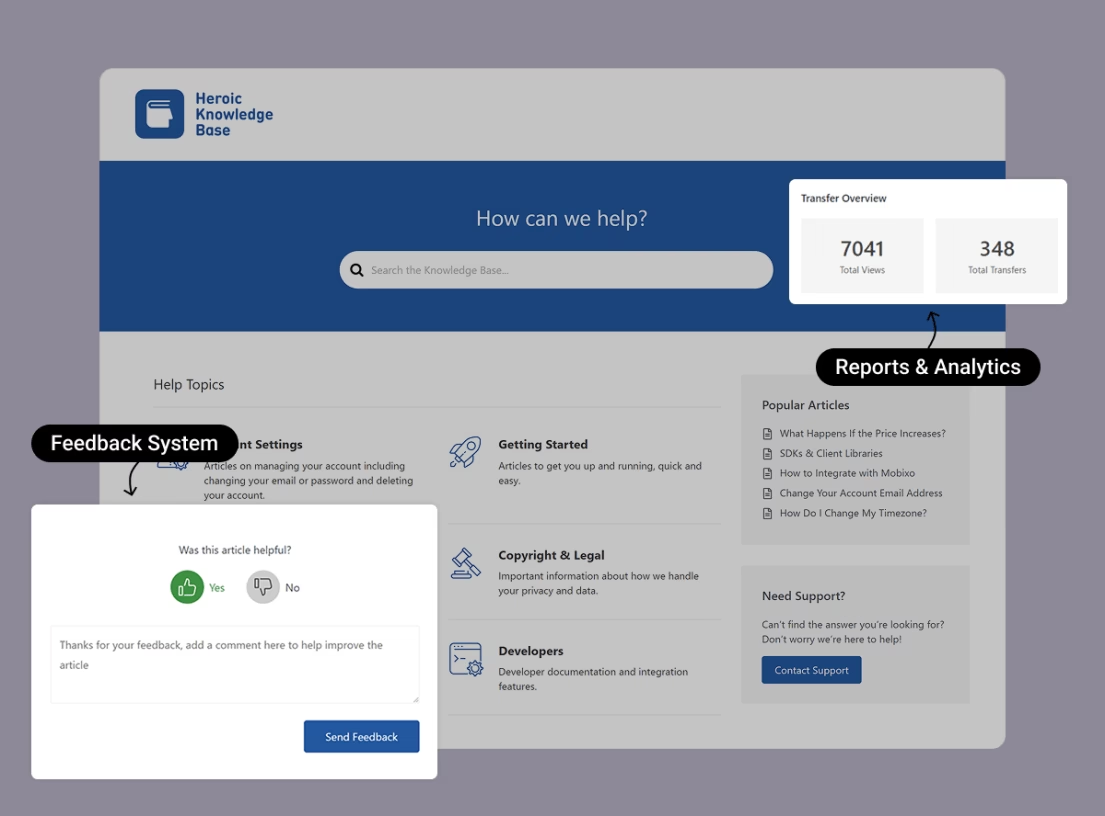
Heroic Knowledge Base
Create a beautifully designed, searchable knowledge base in minutes.
In This Guide
What the Best Knowledge Bases Have in Common
Before we explore individual knowledge base article examples, let’s highlight a few traits shared by the most effective ones:
- Robust search functionality: A knowledge base without search functionality? Seems like a nightmare for customers. The help center puts a search bar front and center. Often, it’s smart, offering live suggestions or autocomplete to get users to the right answer faster.
- Clear organization and categorization: Group content into intuitive categories or sections. Like Account & Billing or Getting Started guides.
- Comprehensive, up-to-date content: Cover all the common questions with concise, jargon-free articles.
- Multi-format help (text, visuals, etc.): Make your guides simple with screenshots, videos, or even GIFs.
- Feedback and continuous improvement: Provide an option for users to rate articles. This feedback loop helps identify outdated topics.
- Easy access to human support: In some cases, businesses avoid providing costly human support in the name of self-service. Don’t make this mistake. Make it easy for users to reach human support by highlighting it throughout your knowledge base.
10 Knowledge Base Examples to Learn From

We rigorously test and research every product that we recommend through HeroThemes. Our review process. We may also earn a commission if you make a purchase through our links.
1. Google Analytics Help
Google has countless product support hubs, here we’ll talk about the Google Analytics help center as an example of Google’s approach.
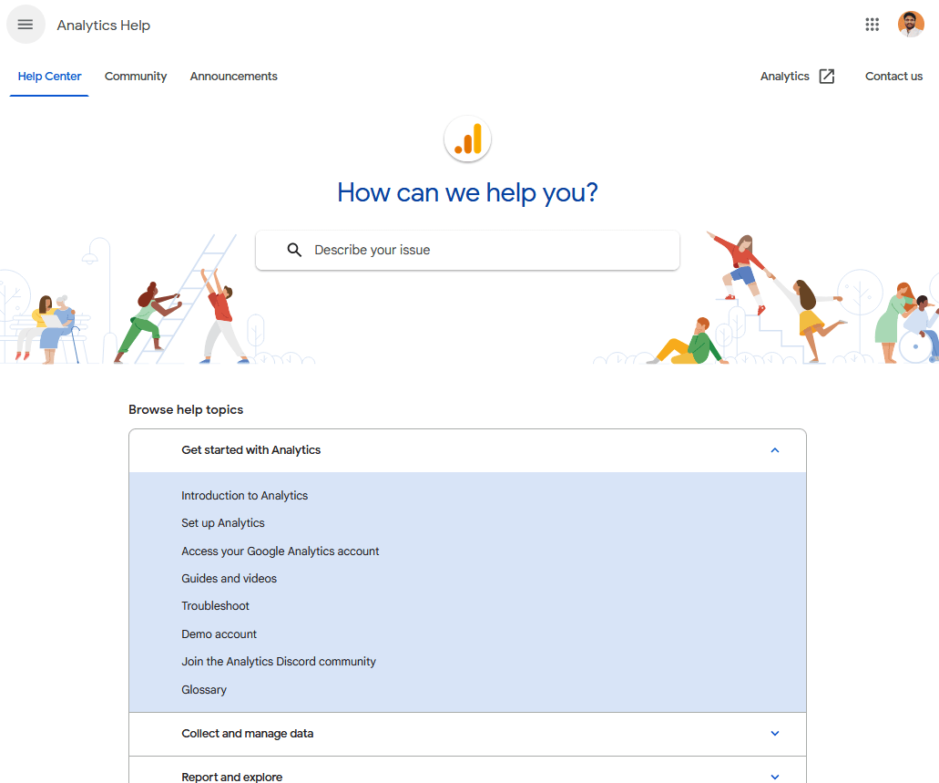
When you visit any Google’s product help center, the first thing you notice is a big, friendly search bar with faint grey text inviting you to “describe your issue”.
After that, you will have easy access to common guides, such as an introduction to analytics, setup, troubleshooting, so on.
A very simple layout that works like a charm for any type of knowledge base.
What you can learn from Google’s knowledge base example:
- Highly functional search bar that is easy to access from any knowledge base page.
- Neat breakdown of guides into categories.
- Easy access to community forums and human support.
- Minimalist design with a bit of personality—you’ll often see small illustrations or Google-colored icons that make the page more engaging without clutter.
- Multiple paths to answers: powerful search, clear categories, community forum, and customer support.
First, focus on building a solid knowledge base of official articles. As you grow, consider empowering a community or at least gathering user feedback on articles to take your knowledge base to the next level.
2. Shopify Help Center
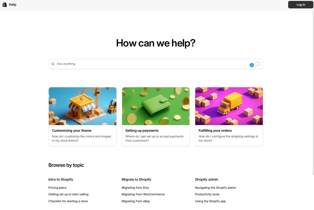
Shopify powers online stores for businesses large and small. Their customer base (store owners, developers, partners) has a wide array of questions.
The Shopify help center is designed to guide new users and support existing ones through every step of running an eCommerce store. But, unlike other examples in this list it fails in many ways.
Here, I will only list the drawbacks of Shopify’s knowledge base, so you can avoid these issues in yours.
What to avoid:
- No search bar in the article (There is one, but it’s hidden in the sidebar menu). Well, users can go to the homepage and search there, but these unnecessary clicks and not finding a search bar right away, which is a common thing to have in knowledge bases, creates frustration.
- Poor AI usages. Exploring Shopify’s knowledge base feels like using poor quality ChatGPT, literally.
- The answer quality is poor
- It’s very slow sometimes
- When you search something on Shopify support, it directly answers through chatbot instead of showing related topics. It could be similar to Google’s knowledge base example, where you show a quick AI answer and related articles.
- “Ask about this article”, an AI feature to explore the article, or something like that. Instead, you could show a quick summary here or focus on simplifying articles more.
- Hard to contact Shopify’s support. There is “contact support” button on each guide, but when you click on it open an AI chatbot 🤦. First, you need to chat with an AI bot, then log in and share many details, no prominent contact option, etc.
After some attempts you can chat with the agent, but it’s clearly trying to avoid users connecting with human support.
There is just so much to improve with Shopify’s knowledge base:
- The articles could use some images and could be simplified slightly.
- AI could be used more effectively, like other knowledge base examples.
- The homepage could feature popular topics instead of random ones, and could use some icons for categories.
- Connecting to the support could be easier. Like submitting a quick contact form.
Hope you had a good idea why Shopify’s Help Center didn’t work for me and how you can avoid the same issues with yours.
3. Apple Support
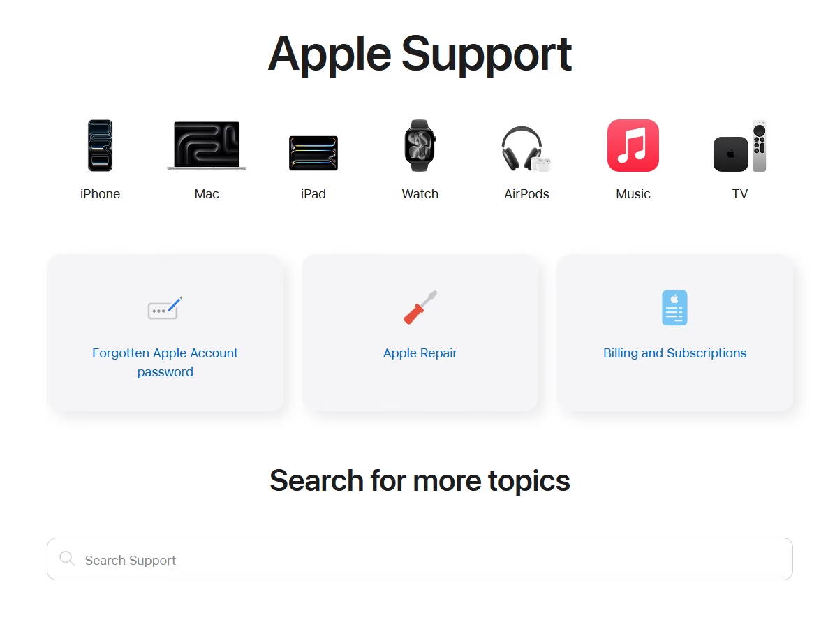
Apple’s support knowledge base features a visually clean start page with icons for product categories and a prominent search bar, mirroring the company’s elegant branding.
Apple’s products are used by millions globally, so their support site needs to handle a vast range of queries.
Apple’s knowledge base is a masterclass in combining aesthetic design with practical navigation.
What you can learn:
- Modern and inviting support homepage. Clever use of product icons and images to improve visual navigation.
- Interactive search bar. When you click that search bar it immediately displays suggestions and starts offering recommendations as you type.
- Consistency and simplicity
- Use of a friendly, non-technical tone. Which is great for less tech savvy customers.
What to avoid?
- If you own a small business, consider highlighting top FAQs upfront. These could include refund policies and payment methods. In Apple’s case, they are 2–3 clicks away from the support homepage or need to be searched.
- Inconsistent dark and light color theme. For example, the support homepage has a light color theme, while the guides have a dark color theme. Switching between these pages felt very annoying to me.
- No search bar on the guides (There is a search icon in the menu, but it is very small to be noticed).
4. Slack Help Center

Slack’s help center keeps things super streamlined. A bold search bar, a few main topics, and some quick links. Making it easy to “Ask anything,” as the tagline suggests.
Slack is a widely-used workplace chat tool, and its user base ranges from techies to non-technical office workers.
Slack’s knowledge base example shows that you don’t need to drown users in links. Sometimes a simple search and a few well-chosen categories get the job done best.
What you can learn from Slack’s example:
- Powerful search and slick navigation. With the help of a menu, breadcrumbs, a table of contents, and even an AI chatbot to get answers or find relevant knowledge base articles.
- Easy to access to popular topics right from the homepage.
- A small number of broad categories, each with a brief description and relevant image.
- A section for “Slack Tips” at the bottom of the help center page. A smart way to surface useful info that users didn’t specifically search for.
5. Netflix Help Center
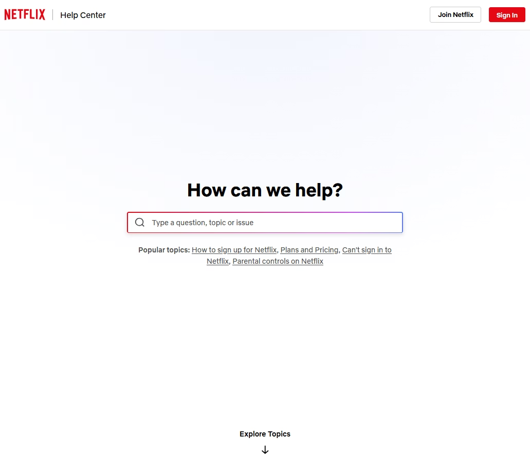
Netflix provides streaming services to over 200 million subscribers worldwide. Their help center needs to address everything from “How do I update my payment?” to device troubleshooting.
When you visit Netflix’s help center, all you can see is a huge search bar in the middle of the screen. Which of course, invites you to search for the issue.
What you can learn from Netflix’s help center example:
- Focus on the search with advanced search features. For example, even if you make a typo, Netflix will still find highly relevant results.
- Right below the search bar, there are links to a few popular topics. Like how to sign up, pricing, etc.
- Netflix also lists the main top-level topics on the homepage, each with popular articles underneath.
- Knowledge base articles are clear, with relevant images, icons and most content is neatly organized with accordions, headings, steps, bullet points, etc.
- You can also view important information (like pricing details or restricted content) based on your country.
- Quick links for specific actions. E.g. to change password or update email.
Netflix makes sure that the 90% of issues that make up the bulk of support volume are front and center. Do the same for your product: figure out the most asked questions and make them one click away on your knowledge base homepage.
Although the Netflix Help Center focuses on helping users search for solutions faster, they forgot to add a search bar to their guides 😛.
Don’t do this with your knowledge base.
6. LinkedIn Help Center
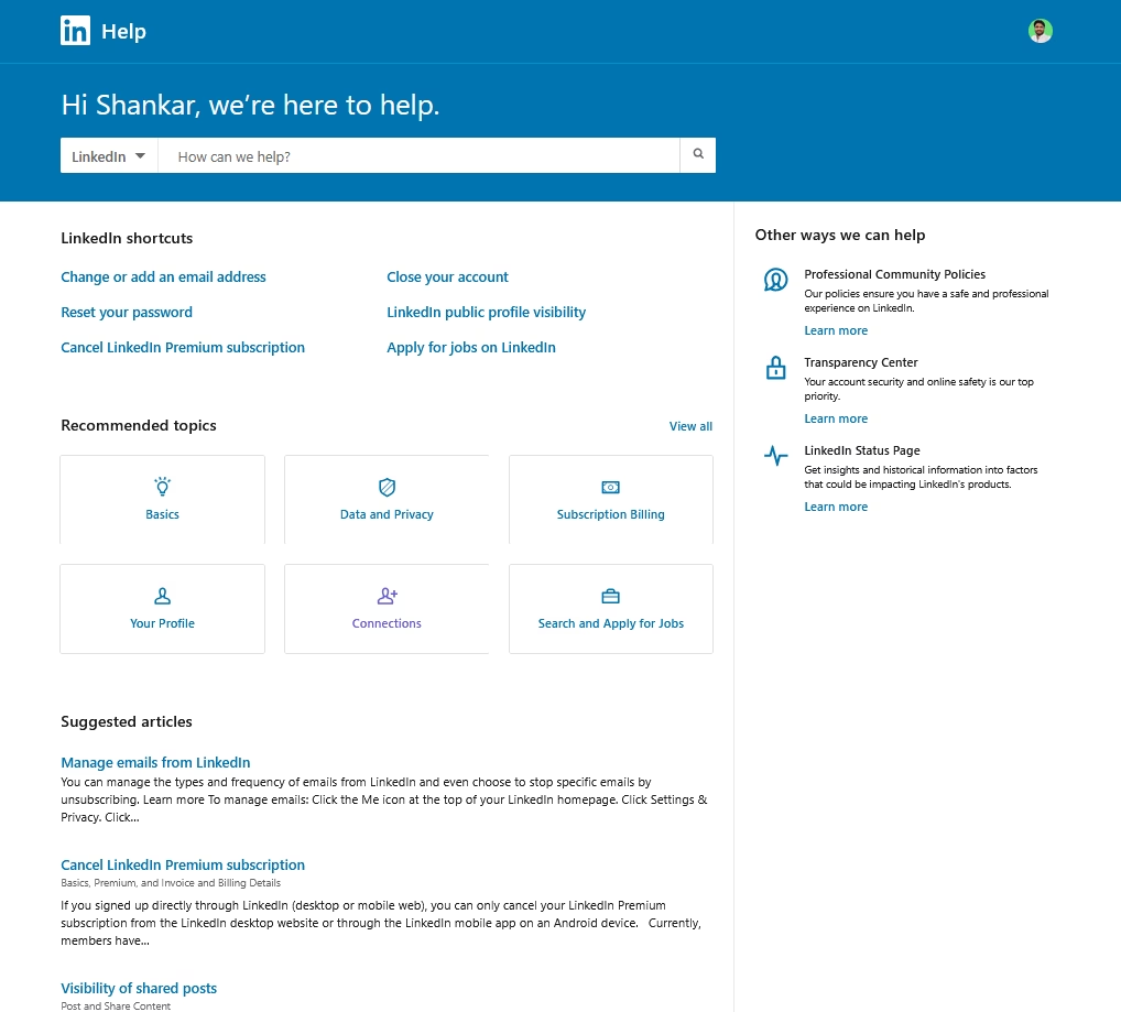
LinkedIn’s help center highlights the most searched issues as “Shortcuts,” helping users quickly access the necessary settings without needing to follow a guide. Kinda similar to Netflix’s quick links.
LinkedIn’s user base ranges from job seekers to recruiters to casual social browsers—a diverse crowd.
Their help center contains a lot of information, and LinkedIn handles this by smart prioritization.
The best thing about LinkedIn’s knowledge base articles:
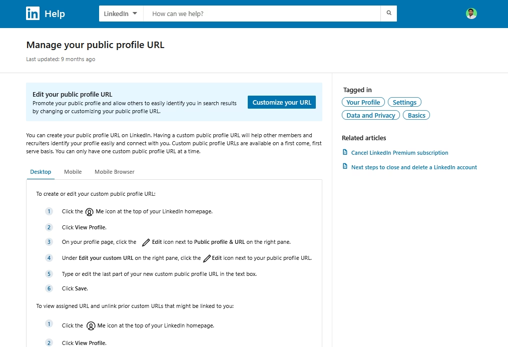
As you can see in the image above, LinkedIn simplifies the tutorial by providing a direct link to the exact setting page, and having a single guide for all types of devices, which prevents confusion during search.
LinkedIn’s articles are clear and well-structured. They use a button to highlight the settings page and tabs to divide the tutorial based on the user’s current device (desktop, mobile, or app). Use a step-by-step list with minimal icons for the actual guide.
Key features and highlights:
- Simple and straightforward guides. Use of numbered lists to provide step-by-step instructions, and avoids fluff content.
- Easy access to create support tickets
- Sticky and powerful search bar
- Minimal design with plenty of white space and a straightforward layout.
Use your knowledge base analytics to your advantage. If you know certain questions or pages are hit most often, do what LinkedIn does and put them front and center, allowing users to instantly access the exact page.
Pages like: refund request, order status, password reset, etc.
A note on design: LinkedIn manages to keep a huge help repository from feeling overwhelming by breaking it into bite-sized links. Users aren’t bombarded with 50 categories at once—just a few key ones and some top questions.
If you have a large knowledge base, display broad categories first instead of showing everything.
7. Spotify Support

Spotify’s support homepage keeps things on-brand with a dark theme, and immediately lists popular help topics (kinda similar to Google’s help center), and AI integration.
Spotify has a lot of content, so they rely on good search and community forums for edge cases.
The best lesson to take away from the Spotify knowledge base example is how to properly use AI.

The answers AI gives here are simple and short. And it uses knowledge base content for information and links to it.
Key features and highlights:
- Uses big, clean category blocks that reduce cognitive load
- Maintains visual consistency with dark mode everywhere (unlike Apple’s constant changing color themes on help center)
- Articles are short with clear microcopy instead of long explanations, and keeps each article focused on one problem only.
- Groups device-specific instructions (Android, iOS, desktop) in the same article.
8. Dropbox Help Center
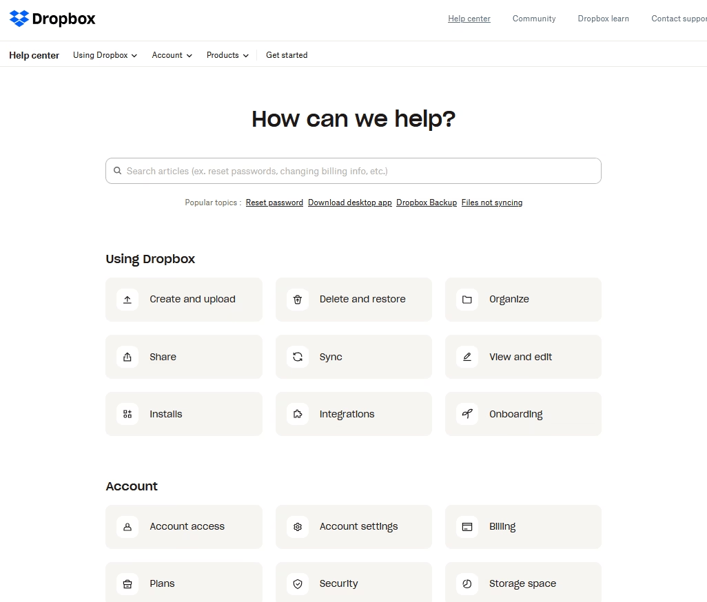
The first impression is how uncluttered the Dropbox knowledge base is.
Dropbox’s help center uses plenty of white space, approachable graphics, and a clear layout to make self-service as easy as saving a file in Dropbox (almost).
Dropbox’s knowledge base stands out for its simplicity and a dash of visual flair.
The key lesson from Dropbox’s example is that the knowledge base doesn’t have to be limited with written content.
A knowledge base can include courses, video tutorials, virtual guides or anything that can help customers learn more effectively.

Key features and highlights:
- Extremely clean, distraction-free layouts
- Uses a sticky menu to provide quick access to frequent help topics. Like the getting started guide and account-related questions.
- Smart separation between “personal,” “team,” and “admin” content.
- Frequent micro-tips inside articles to prevent future errors.
9. Canva Help Center
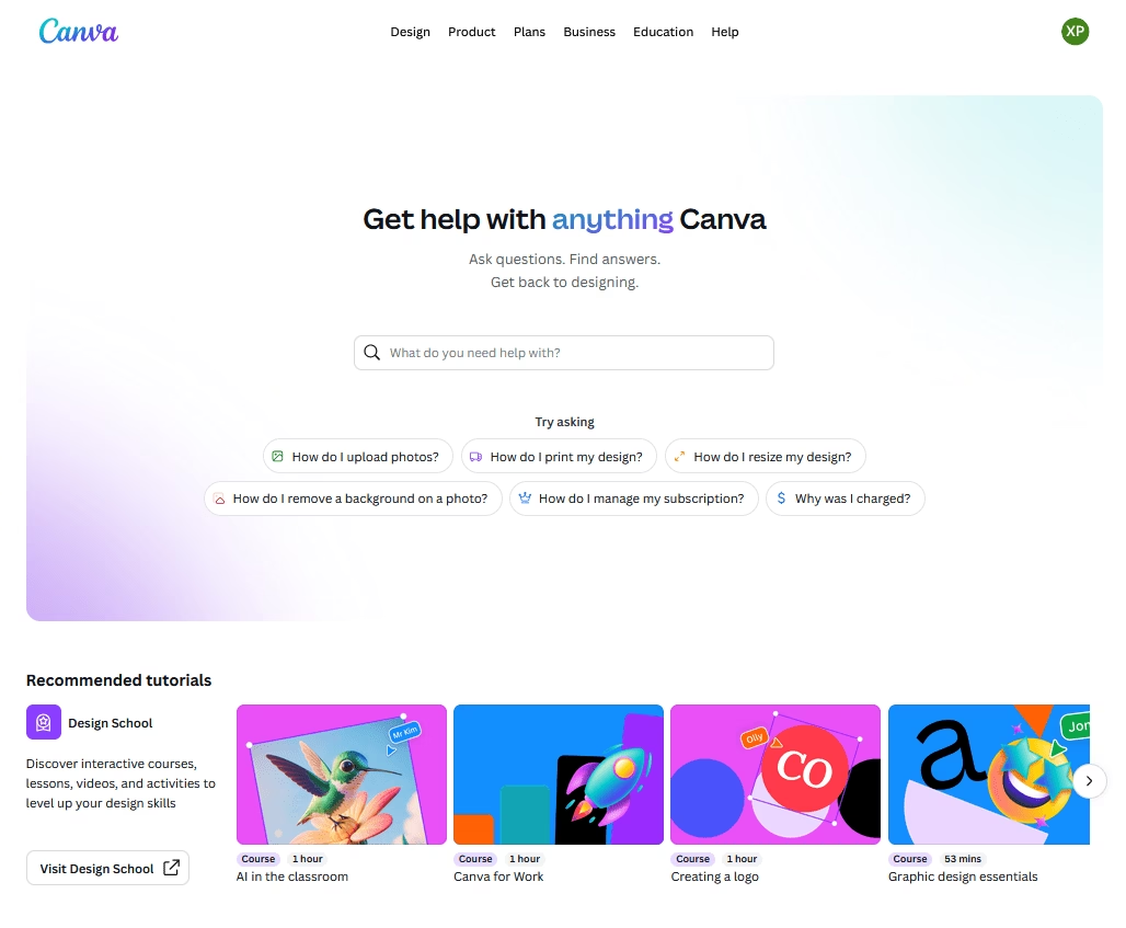
Canva’s knowledge base reflects its design-centric brand—colorful, well-organized, and with handy suggestions that guide you to related information as you browse.
Canva’s example shows that a knowledge base can carry the same visual language as the main product, making users feel at home while seeking help.
Like Dropbox, it neatly integrates its courses, videos with the knowledge base. Which not only solves users’ problems but also encourages them to level up their skills.
Key features and highlights:
- The homepage is bright and welcoming, and feels more like a learning portal.
- Deep integration with AI. An AI assistant that answers questions like a chatbot, quick summaries for guides, and direct AI based answers after search.
- Powerful search bar with AI based answers, which also shows relevant knowledge base articles and recommend courses based on user’s query.
- Also provides quick access to common questions about payments, accounts, troubleshooting, etc.
10. Asana Help Center
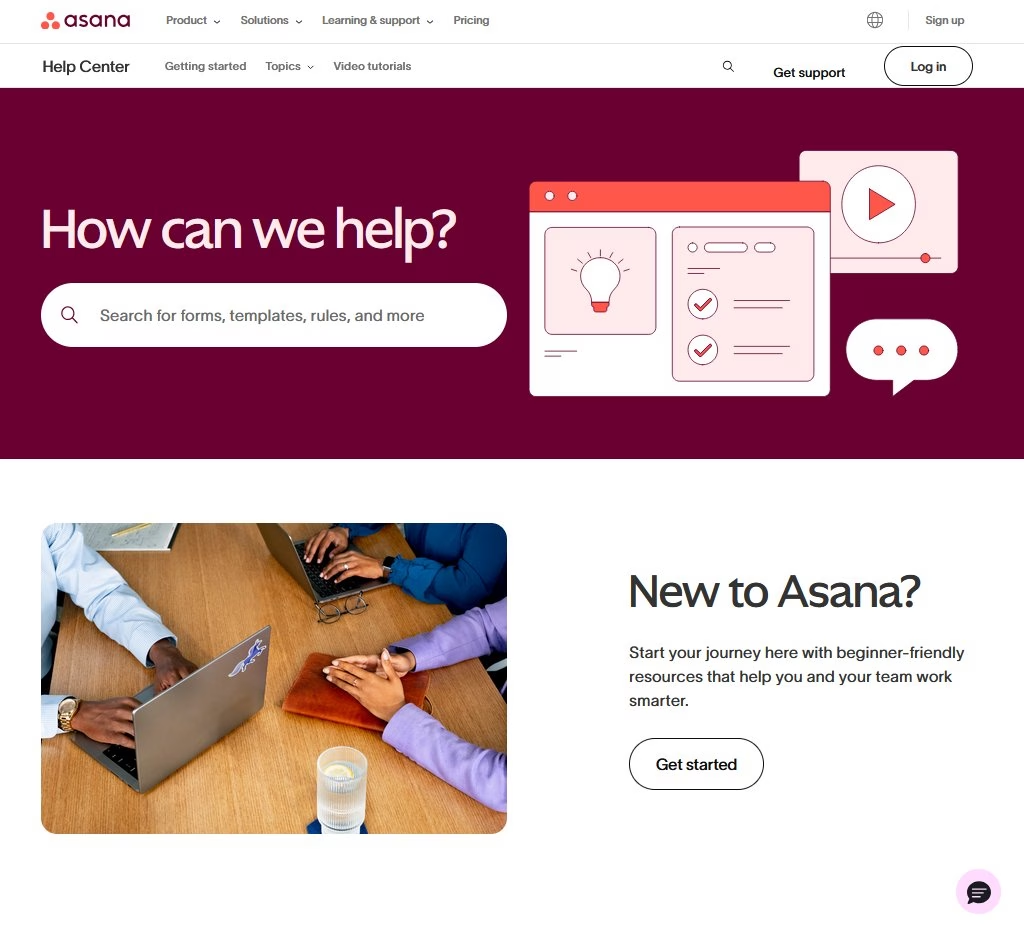
Asana’s support portal is a modern, text-focused layout that lists key resources and offers helpful in-page navigation, making even complex guides easy to navigate.
Similar to Canva, Asana’s knowledge base encourages users to learn more about it with small 1–2-minute video tutorials, courses, and training programs.
Asana’s guides are much more comprehensive than other knowledge base examples in this list. But they don’t feel like it.
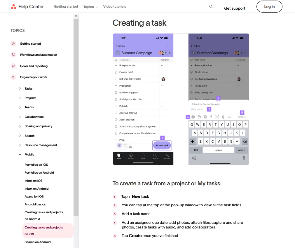
The guides are well-structured, use a lot of images and step-by-step instructions to teach users.
Key features and highlights:
- Focus on encouraging users to learn more about Asana through short videos, and curated courses.
- Use of a grid layout for the support homepage that feels modern and elegant.
- A well-crafted navigation system with table of contents, sticky top menu to access popular topics, and well categorized sidebar menu.
- Guides uses lots of clean product screenshots with callouts, and sometimes quick GIFs that show the complete process without complicating stuff.
- Uses an AI assistant to provide quick answers.
If your product has many features or a lot of depth, consider providing users with tools to help them navigate between and within articles, such as Asana’s sidebar index and tables of contents (a very common feature I found during my research about the best software documentation examples).
This improves the user experience by preventing information overload, so users won’t feel lost on a long page.
One caution: A comprehensive knowledge base like Asana’s requires frequent updates. For example, you have to keep guides updated with product UI changes. So, keep an eye on it.
Build Your Own Best-in-Class Knowledge Base
After seeing what makes these knowledge bases tick, here’s the simplest way to create your own knowledge base today.
Heroic Knowledge Base

Heroic Knowledge Base (Heroic KB), it’s designed specifically to make building and managing a knowledge base easy, even for non-developers.
Out of the box, it gives you a beautifully designed, searchable knowledge base section on your site.
Key features of Heroic Knowledge Base:
- Instant, smart search
- Organized categories and tags
- Feedback system
- Powerful and flexible no-code editor to create articles and unique knowledge base layouts.
- Article analytics and reporting
- Multilingual support
- AI assistant trained on your knowledge base content
- Internal knowledge base support
- Seamless WordPress integration to make use of thousands of other plugins with Heroic Knowledge Base.
You just have to install Heroic KB in your WordPress site > Import demo site > start uploading your content.
Here’s the perfect guide for you to build your knowledge base today.
Further Reading
IT Knowledge Base: What It Is and How to Create One
Knowledge Base Management: Best Practices & Strategies
12 Best Documentation Examples to Learn From (Expert Picks)
9 Wiki Examples: Public Knowledge Hubs & Internal Company Wikis
12 Practical Chatbot Use Cases and Examples Across Industries
9 Best Knowledge Base Software for 2026
Call Center Knowledge Base: Best Software and How to Build


Leave A Comment?
You must be logged in to post a comment.