HeroThemes Formatting Blocks Documentation
The Heroic Blocks plugin allows you to add interactive content to your articles from the new WordPress editor.
These blocks represent an improvement over the old shortcodes, that required special code be inserted into content. It’s now possible to see in real time how content will look to the reader as it is being edited.
It is recommended to use the Heroic Blocks for small amounts of content you wish to differentiate from the rest of an article.
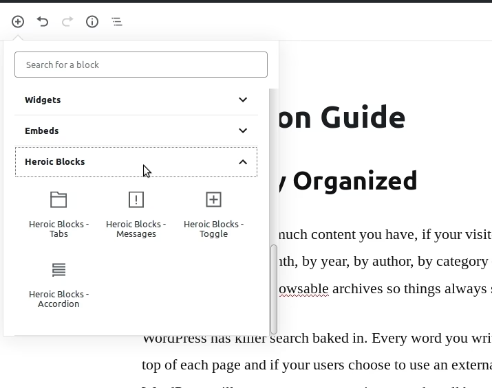
There are four blocks currently available in Heroic Blocks – Tabs, Messages, Toggle & Accordion.
Getting Started
Heroic Blocks requires the plugin is active before they will be available in the editor. It also requires WordPress version 5 or greater.
The Heroic Blocks plugin will usually be installed and activated automatically during the theme setup of a compatible HeroThemes product. If you need to activate the plugin manually, this can be done from the WordPress dashboard in Plugins > Installed Plugins.
Once activated, the included blocks will be available in the Heroic Blocks group in the post editor screen.
These blocks can be added to new or existing content.
Currently the Heroic Blocks can display light formatting and links, they can not include other blocks or rich content such as images. Please bear this in mind as you plan your articles.
Messages Block
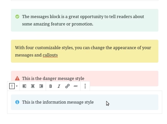
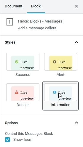
Useful for displaying messages and callouts, the messages block includes four inbuilt styles – Success (default), Alert, Danger and Information. The message colour and icon changes based on the style selected.
In the inspector panel, it’s possible to select the style in the Style section, the Options section is where you can toggle the icon display.
Toggle Block
The toggle block expands and contracts when the heading is clicked. It is useful for hiding/showing additional information.

Tabs Block
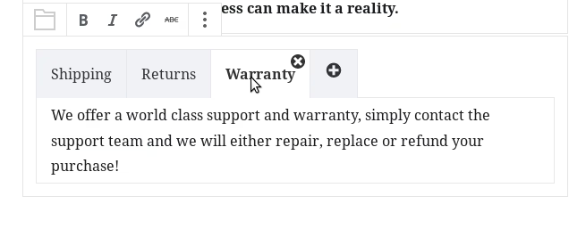
The tabs block splits content into separate sections, useful for displaying information variations of peers in the same category – for example different instructions based on operating system.
Only one tab content is displayed at a time, based on the active tab selected.
Accordion Block
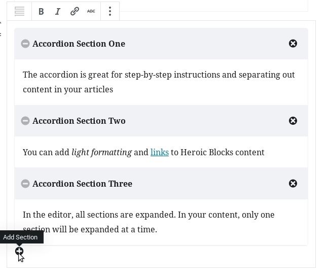
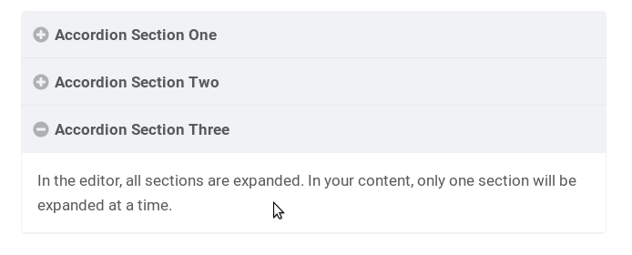
The accordion block is similar to the toggle block in that it can be used to group related content and only one accordion content section is displayed at a time. It’s linear and stacked, so is more useful in displaying step-by-step and sequential information.
